Sidebar Menu using Only HTML and CSS

Sidebar Menu using Only HTML and CSS

Here you will learn how to create Sidebar Menu using Only HTML and CSS. I have created many more sidebar menus but in that case, I have used JavaScript code to make it work. In this case, I did not use any JavaScript or external library.

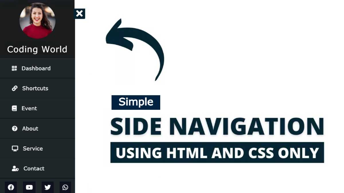
 I have designed the menu on this site using pure HTML and CSS code. Normally it is completely hidden and a small button is found on the home page. When you click on that button, we see the full sidebar menu.

 In this case, I have used the profile image to complete it. I also used icons with each menu item.
 In this case, instead of JavaScript, I have implemented this HTML sidebar menu using the checkbox function of HTML code. As I said under normal conditions only we can see a small button. When you click on that button, the full sidebar will appear. This sidebar has a small cancel button which, when clicked, will completely hide the menu bar again.

Video Tutorial of Side Navigation Menu

If you do not understand what I am saying then you can watch the video tutorial below. The video below will help you learn how it works and how I made it.


 First of all, I used a profile image in this design. Below that, I have a place to give the title. I have used background: # 020a0ee1 in this header section. 

Here I have used many menu items. I have used an icon with each menu item which adds a lot to the beauty of this CSS sidebar. Below all, I have used 4 social media buttons here. I have used the hover effect on the link here. When you click on those items, those menu links will move a little to the right.

Sidebar Menu using Only HTML and CSS

I have tried to explain to you step by step the complete tutorial on making it. Also, if you want to download this required source code, use the download button at the bottom of the article.

Step 1: Create the basic structure of the sidebar

 First of all, we have created the basic structure of the sidebar. In this case I have used the background: # 020a0ee1 of the menu bar and its width: 250px. If you want to change its background color then you can use any other background color instead of the color I used here.


 <div class="sidebar">
 
 </div>


* {
  margin: 0;
  padding: 0;
  list-style: none;
  text-decoration: none;
}
 
.sidebar {
  position: absolute;
  width: 250px;
  background: #020a0ee1;
  transition: all 0.5s ease;
}


Create the basic structure of the sidebar

Step 2: Add profile images and titles 

In the header section, I have a profile image and a text Used. I have used the height and height of this image as 120px. In this case, you must use a rectangular image. Border-radius: 50% is used to round the image.

 The text used in this case is font-size: 22px and padding: 15px. The padding helped to create some space around it.


<header>
   <img src="img.jpg">
   <p>Foolish Developer</p>
</header>


.sidebar header {
  font-size: 22px;
  color: #fff;
  text-align: center;
  line-height: 30px;
  background: #1a1c1dec;
  font-family: Verdana, Geneva, Tahoma, sans-serif;
  user-select: none;
}

.sidebar header img {
  border-radius: 50%;
  width: 120px;
  height: 120px;
}

.sidebar header p {
  padding: 15px;
}


Add profile images and titles

Step 3: Add menu items to the sidebar

Above we have created a header section and now we will add the necessary menu items. Since I have used icons in this case, you must add a font awesome CDN link to your HTML file which will help to make these icons work.


<ul>
    <li><a href="#">
    <i class="fa fa-qrcode"></i>Dashboard
    </a></li>

    <li><a href="#">
        <i class="fa fa-link"></i>Shortcuts
    </a></li>

    <li><a href="#">
<i class="fa fa-book"></i>Event
    </a></li>

    <li><a href="#">
<i class="fa fa-question-circle"></i>About
    </a></li>

    <li><a href="#">
<i class="fas fa-desktop"></i>Service
    </a></li>

    <li><a href="#">
  <i class="fas fa-user-shield"></i>Contact
    </a></li>
</ul>

Step 4: Design menu items with CSS 

We will design the links added above using CSS code. Font-size: 18px and line-height: 65px have been used for each item. Padding-left: 40px has been used to keep these menu items slightly apart. 

The color white has been used and a border has been used below each menu item and one at a time. I used margin-right: 16px between the icons to keep some distance between the icons and the menu items.

If you have seen the demo, you will understand that I have added a hover effect here. When you click on the menu items, a blue border appears on the left. For this I used border-left: 10px solid rgb (50, 200, 238).


.sidebar ul a {
  display: block;
  height: 100%;
  width: 100%;
  line-height: 65px;
  font-size: 18px;
  color: #fff;
  padding-left: 40px;
  box-sizing: border-box;
  border-top: 1px solid rgba(80, 80, 80, 0.329);
  border-bottom: 1px solid black;
  font-family: Verdana, Geneva, Tahoma, sans-serif;
  transition: 0.4s;
}
.sidebar ul a i {
  margin-right: 16px;
}
/* hover effect */
ul li:hover a {
  border-left: 10px solid rgb(50, 200, 238);
}


Side navigation Menu using HTML and CSS

Step 5: Create social buttons

Below, I have added four social media icons. Here I have added links from Facebook, YouTube, Twitter, and WhatsApp. You can use other icons if you want. Font-size: 20px and background: # 05071aa1 of those icons have been used.

 padding: Added 10px to create some space. Margin-left: 16px is used to keep the icons away from each other. The hash effect has been used on the icons. When you click on the icons, the color of these icons changes and turns green.


<li>
  <div class="social-links">
    <a href="#"><i class="fab fa-facebook"></i></a>
    <a href="#"><i class="fab fa-youtube"></i></a>
    <a href="#"><i class="fab fa-twitter"></i></a>
    <a href="#"><i class="fab fa-whatsapp"></i></a>
        
   </div>
</li>


.social-links i {
  padding: 10px;
  margin-left: 16px;
  margin-top: 10px;
  color: #fff;
  background: #05071aa1;
  font-size: 20px;
}
/* icons hover effect */
.social-links i:hover {
  color: #67fd41;
}


CSS sidebar menu

Step 6: Create menus and cancel buttons 

Now I have created the menu button and the cancel button using the check box. The menu button will help to show the sidebar completely and the Cancel button will help to hide it again.


<input type="checkbox" id="check">

<label for="check">
  <i class="fa fa-bars" id="btn"></i>
  <i class="fa fa-times" id="cancle"></i>
</label>


Step 7: Design two buttons with CSS

 I designed the buttons with the help of CSS below. In this case, I have used display: none to hide the checkbox. I used two buttons background: # 042331.


#check {
  display: none;
}
label #btn,
label #cancle {
  position: absolute;
  cursor: pointer;
  background: #042331;
  color: #fff;
  border-radius: 3px;
}

 Now I have determined the position of those two buttons.


label #btn {
  left: 40px;
  top: 25px;
  font-size: 35px;
  color: #fff;
  padding: 6px 12px;
  transition: all 0.5s;
}
#cancle {
  z-index: 1111;
  left: -195px;
  top: 17px;
  font-size: 30px;
  color: #0a5275;
  padding: 4px 9px;
  transition: all 0.5s;
}

Step 8: Activate the sidebar

 Now I have implemented those two buttons. First of all, here I used left: -250px to hide the sidebar. So far we have been able to see the sidebar completely but using this code it will be completely hidden.

Then I used the click function (check: checked ~) and here I used left zero. This means that when you click on the menu button, it will be left: 0. As a result, we will see the sidebar again.

Then I set the position after clicking Cancel and the menu button.


.sidebar {
  left:-250px;
}

#check:checked ~ .sidebar {
  left: 0;
}
#check:checked ~ label #btn {
  left: 250px;
  opacity: 0;
  pointer-events: none;
}
#check:checked ~ label #cancle {
  left: 245px;
}
#check:checked ~ section {
  margin-left: 250px;
}


Responsive sidebar menu using html and css

 This is an easy and simple way to create sidebar menus. Earlier I made menu bars on many other types of sites. If you want you can see those designs. If you want the source code to create it, use the download button below.


Comments

Popular Posts

Animated Progress Bar using Only HTML and CSS

Animated progress bar is mainly used in various business and personal web sites. css progress bar helps to organize your knowledge in a beautiful way. In this article, I am going to show you how to create an animated progress bar using only HTML and CSS code. I have made many other types of Progress Bar before but in that case, I have used JavaScript.  I have not used any JavaScript or external JavaScript library for this design. I created this Animated Progress Bar design using Pure HTML and CSS code. Skill bars are used on various websites to streamline the amount of experience, education, etc. with the help of animations. First of all, I have given the background-color: # 30336b of a web page. Then I made a small box here. I used four CSS Progress Bar in that box. The value of this bar will be zero when opening the page then gradually it will reach the pre-determined meaning. Video Tutorial of Pure CSS Progress Bar If you want to know how to make it better then you...

Sidebar Menu Using Only HTML and CSS

This article shows you how to create sidebar menus using HTML and CSS code only. I have previously created many types of sidebars and navigation menubars using only HTML and CSS code so you can see those designs if you want.  Side Menubar A popular web element is currently used in the sidebar along with menubars on various websites. Undoubtedly the side menu bar is much more attractive and for this, the quality and beauty of the website are greatly enhanced. Under normal circumstances, I have completely hidden the menu bar on the web page.  There is a menu button that can be clicked to view the entire menu bar. There is also a cancel button which, when clicked, will completely hide the sidebar. In the sidebar, I have added links to various menu items, profile names, profile images, social media platforms.  First I gave the profile image and below that, I gave the profile name. Then I added some menu items here and added icons to each menu item. Then I created the...

Responsive Navigation Menu Bar using only HTML & CSS

Responsive navigation menu bar plays an important role for every website. The navigation menu bar creates user satisfaction with the beauty of the website. The user needs a responsive navbar so that he can easily find the topic of his choice.  I have designed many more types of menubars before. But in that case, I used JavaScript code to execute the menu button. I have not used any JavaScript or external JavaScript library for this design. I have created this Responsive Navigation menu bar using pure CSS and HTML code. I only used CSS code to make it responsive. I have made it responsive using only the  @media function of CSS code. Here I have basically used a logo and used five menu items . I have used the hover effect on the menu links. The background color will change when you click on those items or move the mouse. Video Tutorial of Responsive Navigation Menu Bar You can watch the video tutorial below to know how it works and how to make it. How T...

Automatic Image Slider using Only HTML & CSS

In this article, I am going to show you how to create an automatic image slider using only HTML and CSS code. We know that an image slider is a simple web element that is used to organize different images of the website in one place.  There are different types of image sliders and the most automatic image slider is used. This type of slider is mainly used in the hero section of the homepage of various websites. In addition, different types of services or portfolio websites are used to decorate the images of many types of projects.  Basically, this type of design has no navigation buttons which means there is no way to change the image manually. The images here will continue to change automatically from time to time. You can set this time in advance.  First of all, I set the background of a web page to black. Then I arranged all the images nicely there. In this case, I did not use any JavaScript code . It was created using effects in the animation of css3. ...

3D Image Slideshow using Only HTML and CSS

3D Image Slideshow is a type of image gallery that is currently used on a variety of websites. It helps to keep many types of images neatly arranged together. This not only enhances the beauty of the website but also user satisfaction.  I have already created many types of image sliders and image galleries but it is a little different. Basically, we use JQuery or JavaScript to change the image in other designs. However, I did not use any JavaScript in this case. In this case, I made it using only HTML and css3 . Yeah Al that sounds pretty crap to me, Looks like css3 just got used to the modern animation effect .  In this case, no button was created to change the image. It tends to change from time to time by itself. This means that it is an automatic 3d image slider built with HTML and CSS code only. This 3D image slider is like a square box. At certain intervals, this box rotates from right to left. I have used four images around this box. When the box is rotated, e...