Animated Progress Bar using Only HTML and CSS

Animated Progress Bar using Only HTML and CSS

Animated progress bar is mainly used in various business and personal web sites. css progress bar helps to organize your knowledge in a beautiful way.

In this article, I am going to show you how to create an animated progress bar using only HTML and CSS code. I have made many other types of Progress Bar before but in that case, I have used JavaScript.

 I have not used any JavaScript or external JavaScript library for this design. I created this Animated Progress Bar design using Pure HTML and CSS code. Skill bars are used on various websites to streamline the amount of experience, education, etc. with the help of animations.

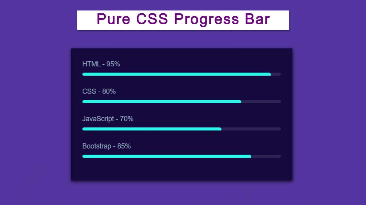
First of all, I have given the background-color: # 30336b of a web page. Then I made a small box here. I used four CSS Progress Bar in that box. The value of this bar will be zero when opening the page then gradually it will reach the pre-determined meaning.

Video Tutorial of Pure CSS Progress Bar

If you want to know how to make it better then you can watch the video tutorial below. This HTML
 Here you can see how the Progress Bar works.


Hopefully, the video tutorial above has helped you to know how this Progress Bar is built using only HTML and CSS code.

Animated Progress Bar using Only HTML and CSS

 If you want to get the required source code, use the download button at the bottom of the article. If you want to know how to make it step by step, then you must follow the tutorial below.

 After each step, I tried to explain the possible result with the help of pictures. As a result, even if you are a beginner, you can learn how to create an Animated Skills Bar from this tutorial.

Step 1: Design the web page

First of all, I designed the web page using the following HTML and CSS code. I have used the background color of the webpage: # 30336b and height and width 100.


* {
  box-sizing: border-box;
  margin: 0px;
  font-family: sans-serif;
  padding: 0px;
}

body {
  user-select: none;
  background-color: #30336b;
  display: flex;
  justify-content: center;
  align-items: center;
  width: 100vw;
  height: 100vh;
}


Design the web page

Step 2: Create a box on the webpage

 Using the HTML and CSS code below, I made a small box on the web page. There is a small box on the web page as you saw in the demo above. 

All the designs have been made in that box. The following HTML and CSS code helped to create and design this box.


<div class="iner-wrapper">
 
</div>


h1 {
  font-weight: 400;
  font-family: sans-serif;
  font-size: 40px;
  color: white;
  text-align: center;
  margin-bottom: 90px;
}

.iner-wrapper {
  padding: 30px;
  background-color: #130f40;
  width: 70vw;
  height: auto;
  box-shadow: 1px 3px 8px 0px #000000d4;
}


Create a box on the webpage

Step 3: Add progress bar information

Now I have added all the elements for this bar using HTML code.


      <div class="skill-bar">
        <div class="info"><span>HTML -  95%</span></div>
        <div class="progress-bar html"><span></span></div>
      </div>
      <div class="skill-bar">
        <div class="info"><span>CSS - 80%</span></div>
        <div class="progress-bar css"><span></span></div>
      </div>
      <div class="skill-bar">
        <div class="info"><span>JavaScript - 70%</span></div>
        <div class="progress-bar javascript"><span></span></div>
      </div>
      <div class="skill-bar">
        <div class="info"><span>Bootstrap - 85%</span></div>
        <div class="progress-bar bootstrap"><span></span></div>
      </div>


Add progress bar information

Step 4: Design the skill bar using css code

I will design the elements added above using the CSS code below. I have taken the color of the text used above as white and font-size: 18px. Here we have used margin: 2px 0px to create some space around the text.

I have used this pure CSS progress bar's line height 8px and length 100%. I have used white as the background color for this line and border-radius: 10px to make the two ends slightly rounded.


.skill-bar .info span {
  display: inline-block;
  margin: 2px 0px;
  font-size: 18px;
  font-weight: 500;
  color: #95afc0;
}

.progress-bar {
  position: relative;
  overflow: hidden;
  margin: 20px 0px;
  width: 100%;
  height: 8px;
  background-color: #ffffff1a;
  border-radius: 10px;

}


Design the skill bar using css code

Step 5: Add animation with CSS3 

Now I have designed the color animation that works on Progressbar. When you fix a specific value in this program, this color animation will stick to that specific value.

 In this case, I have used the background color a little brighter so that it can be seen clearly. position: absolute so that the color line is located within. transform-origin: left has been used, meaning that when this animation works, it will start from the left.

transform: scaleX (0) is used which indicates that under normal conditions it will be absolutely zero. That means no animation can be seen.


.progress-bar span {
  position: absolute;
  background: #0bf9f9;
  width: 100%;
  height: 10px;
  border-radius: 10px;
  transform: scaleX(0);
  transform-origin: left;
  animation: animate 1s 1s cubic-bezier(1, 0, 0.5, 1) forwards;
}

Now we have set the value of transform: scaleX using @keyframes animation. In the case of 100% transform: scaleX () has used the amount 1, that is, we see the color line in the progress bar.


@keyframes animate {
  100% {
    transform: scaleX(1);
  }
}


Add animation with CSS3

Step 6: Add custom values to this css progress bar

As you can see in the picture above the color line has reached 100% for each bar here. Now I will use different custom colors for each case. 

I have used the width of the HTML: 95%, in that case, the color will be 95% out of 100%. Similarly for CSS, JavaScript and bootstrap I have set a certain width.


.html span {
  width: 95%;    /* html bar custom values */
}
.css span {
  width: 80%;
}
.javascript span {
  width: 70%;
}
.bootstrap span {
  width: 85%;
}


Add custom values to this css progress bar

Step 7: Add custom colors to it

Above we have completed this process. This time I will use a custom color. As you can see in the picture above, each progress bar has the same color. Now I will use a different color for each bar.


.html span {
  background-color:red;   /* html bar color */
}

.javascript span {
  background-color:yellow;     
}
.bootstrap span {
  background-color:pink;
}


Progress Bar using Only HTML and CSS

We hope you enjoy this Animated Progress Bar tutorial. If you can learn how to make css progress bar from this article, please share this article. 

In the meantime I have created many more types of designs using HTML CSS and JavaScript you can see if you want. If there is any problem then of course you can let me know by commenting.


Comments

Popular Posts

Sidebar Menu Using Only HTML and CSS

This article shows you how to create sidebar menus using HTML and CSS code only. I have previously created many types of sidebars and navigation menubars using only HTML and CSS code so you can see those designs if you want.  Side Menubar A popular web element is currently used in the sidebar along with menubars on various websites. Undoubtedly the side menu bar is much more attractive and for this, the quality and beauty of the website are greatly enhanced. Under normal circumstances, I have completely hidden the menu bar on the web page.  There is a menu button that can be clicked to view the entire menu bar. There is also a cancel button which, when clicked, will completely hide the sidebar. In the sidebar, I have added links to various menu items, profile names, profile images, social media platforms.  First I gave the profile image and below that, I gave the profile name. Then I added some menu items here and added icons to each menu item. Then I created the buttons of fo

Popup Login Form using Only HTML & CSS

In this article, I am going to show you how to create a pop-up login form using only HTML and CSS code. I have previously designed many more types of pop-up login forms , but in that case, I have used JavaScript. I did not use any JavaScript code in this design, only pure HTML and CSS code. In the case of this type of design, the complete login form is hidden. Instead, a button appears on which the complete login form can be viewed by clicking on it. One type of design is much more attractive than the usual login design and enhances the quality of the website a lot.  Like the normal form, it has everything here, namely the place to input the email ID and password and a login button. First I made a small button on the web page. Clicking on that button will show the complete login form.  There is a small cancel button in the login form which if clicked will hide the complete login form again. Video Tutorial of Popup Login Form If you want to know the complete step-by-step how I made